A List Apart: “Whitespace is often used to create a balanced, harmonious layout. One that just ‘feels’ right. It can also take the reader on a journey through the design in the same way a photographer leaves ‘looking room’ in a portrait shot by positioning the subject off the center of the frame and having them looking into the remaining space. When whitespace is used to lead a reader from one element to another, it’s called ‘active whitespace.'”
Category / Design
Consider the Dust Jacket
Over at Foreword, alternative covers to Consider the Lobster are being considered
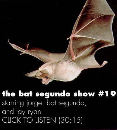
The Bat Segundo Show #19
Author: Jay Ryan
Condition of Mr. Segundo: Not savvy with current music but remarkably focused.
Subjects Discussed: How Jay Ryan transforms a concept to music poster, whether or not squirrels attack astronauts, Shellac, Werner Herzog, hand-drawn typography, grumpiness, what happens when bands get an unexpected poster, printing on a mechanical press, smudge marks, bleeding, Rockwell Kent, apocalypses, getting involved with Michael Chabon, book covers, unintentional obliqueness, Fugazi, subtext and association, observing people through the window, planting a seed, the disadvantages of Photoshop and Illustrator, and working within limitations.
