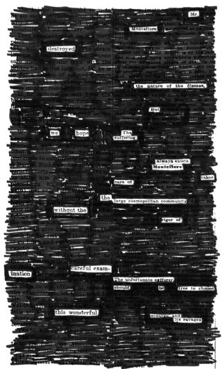
 Austin Kleon is the author of Newspaper Blackout.
By permanently altering the original newspaper articles, how do you feel that you’re respecting the original authors? Why do you feel that this material is fair game for artistic appropriation?
I could tell you a big story about how I’m respecting the original newspaper writers by rescuing their ephemeral work from lining the trash bin or wrapping fish and turning it into something permanent, something poetic, something eternal…but that would be a huge load of bullshit. Truthfully, I’m a writer that was having trouble finding my own words, and decided to borrow words from the medium that produces millions of them every day and delivers them to my doorstep.
If I were to try to justify it, I’d say that what I’m doing is no different than what writers have done forever. They borrow words from the language, and they rearrange them into a unique order.
I truly love newspapers. I grew up with newspapers. My parents didn’t sit around reading novels, but we subscribed to two daily newspapers. My father-in-law, one of the best writers I know, has worked for a newspaper in Cleveland for over 25 years, and my uncle worked for a newspaper for twenty years before he decided to become a preacher. (A good career move on his part.)
I’ve resisted developing an iPhone or iPad Newspaper Blackout app because I think there is magic in feeling the newsprint in your hand and the words disappearing under that marker line. (I experimented with making poems on the iPad, but I returned mine back after a week.) I think the more that writing is made into a physical process, the better it is. The more writing is something you make with your hands, the more satisfying it is for me. Same goes for books. I like holding on to something.
Were there any legal hurdles from Harper Perennial with regard to fair use? (I’m assuming this is one of the reasons why you couldn’t use photos.) Did the original articles or the typography — that is, the material beneath the blackout — have to be altered in any way aside from the black marker? Also, did you photocopy any of the articles for “drafts” of your poems? What practice did you do? Can you offer an example or two on how you stumbled onto specific word patterns?
The lawyers took a look at the project and gave it the green light before we even signed a deal.
I stopped using photos a while back when I realized that using complete photos would move the poems out of the realm of fair use. (Occasionally I’ll use a little sliver or a crop of a photograph, like in this poem, “In A Honky Tonk In Texas.”)
What’s interesting to me is that I think legal constraints actually lead to better poems.
There are basically four factors that determine fair use: 1) how transformative it is, or “purpose and character” of the use; 2) the nature of the copyrighted work (usually if it’s non-fiction or fiction); 3) the “amount and substantiality of the portion taken”; 4) the “effect of the use upon the potential market.”
So some of my own rules are actually based on these factors: 1) I try to transform the text into a poem that doesn’t resemble the original subject matter of the article, or if it does, it parodies or reverses it; 2) I only black out newspaper articles; 3) I usually take less than a sentence or a phrase at a time and black out way, way more than I keep. When it comes to number 4, I probably have a positive (if tiny) effect on their market, by giving people another reason to buy newspapers!
What you see in the book are actual scans of the marker on newsprint. I didn’t do any photocopying to practice or create a first draft, although, there were some poems where I wish I had. (Permanent marker leads to all kinds of accidents.)
The book was made in a six-month period from June – December 2008. I cut up newspapers into little paperback-sized clippings, and kept the clippings all in a folder, and on the bus ride to and from work , and in the basement of my office on my lunch break, I’d pull out a clipping and get to work.
I wish I could show you or explain how these things happen, but usually I just see an anchor word or an anchor phrase that grabs my attention, and I just work out from that, slowly. (Here’s a time-lapse video of me doing one that might give you an idea of how it works.)
In some cases, we can see that you’re running low on ink (such as the poem on Page 39) as you’re slashing through the newspaper. To what degree did such practical ink conditions affect the form of the poem? (I ask because the Page 39 poem also begins with the phrase “Gasoline is running out,” thus mimicking the ink problem.) Additionally, were there specific “low ink” markers you kept nearby for specific textures or looks?
I wish I was that smart, but in fact, it was just a matter of whether the marker I had in my bag was low or not. I went through a few dozen markers making the book. It’s funny how the ones where the marker doesn’t completely cover everything look way more interesting. I resisted touching them up when I got back home because I liked the way they looked.
I read an article in The Believer about the history of the permanent marker, and was shocked to find out that government censors, back when they still used markers, would use red or brown markers, so you could still see the text that was redacted, then they’d run the redacted documents through a photocopier set on high contrast, which is what gives them that stark black and white look. After I read that, I toy ed with the idea of doing all my blackouts from now on in red ink…
The poem on Page 50, for example, certainly could not look the way that it does without physical contact with the article. On the other hand, I’m naturally quite suspicious about the arrows on Page 60, which were surely aided by scanning and digital retouching to get the precise look of the arrows. To what degree did you rely on digital enhancement for these poems? Were there any specific ground rules that you established along these lines?
There was actually little digital manipulation involved. When I scanned the poems into the computer I set the contrast way high (like a photocopier) so they got that high-contrast look, and then I cleaned up some of the leftover words around the black marker on the edges. In a few very rare instances, I would use Photoshop to fix a screw up where I accidentally marked over a letter. (Only to reveal a letter that had been blacked out, not to put in a letter where it wasn’t before.)
The arrows were made on the original newsprint with a ballpoint pen and the white space from the lines in between the words.
All the poems became image files, which, when they were sent to the publisher, had the added benefit of being incredibly hard to edit — in fact, aside from my editor pointing out a few weak poems, there wasn’t much editing done to the poems in the book at all.
There are actually typos on pages 50 and 84. Each page contains duplicate words, which can easily be fixed with a marker. (I’ve turned this into a shtick at book signings: “Would you like me to fix your typos?”)
Speaking of the little boxes that form thin flowchart lines leading from one word to another (there’s a very nice series of dashed boxes on Page 111 or, even more impressively, on Page 113), how did you arrive at the specific length and width for these little etchings? Did you ever consider using a portion of a letter to help create or nudge a shape?
All those little lines were constrained by the white space in between the words of the article. I honestly didn’t plan them out too much.
When you are highlighting a clustered phrase, such as “detectives gathered at the scene of a mystery” on Page 62, isn’t this a little too easy? Should not the reader’s eye be trained not to find the obvious patterns within an article, but the not so obvious ones?
I try to make it as easy to read as possible. I don’t want to have people struggling to make sense of the poem because they’re not sure in what order the poem is supposed to be read. I get a lot of poem submissions from folks on the Newspaper Blackout Tumblr, and sometimes I have to really stare at a poem to figure out how it’s supposed to be worded. It can be frustrating. And frustrating readers is the last thing I want to do.
On the other hand, I do like that the form can make people slow down and think about the language. My wife is a speed reader, and she finds it incredibly difficult to read these things, because it forces her to slow down and really focus on one word at a time.
Capitalized letters and only letters often serve as crutches (see Page 146) for you to get a poem out of what I presume was difficult material. But I’m wondering if you worked in a deliberately counterintuitive manner for some of these articles (i.e., did you see an obvious poem and deny yourself the pleasure because it was “too easy”).
I never deny myself the pleasure of an easy poem! Nine times out of ten, I’m usually tearing my hair out when I do these things, so when an easy one appears before me, I take it, because I know the next one won’t be so easy.
© 2010, Edward Champion. All rights reserved.

Sheer excitement. Hurrah for our side. Thanks for the boost, Ed!